Programming Page
Who can use this feature
Site Admin, Channel Admin
Supported features: User Pages
Introduction
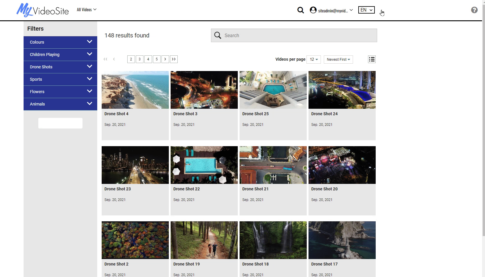
The Programming Page Widget automatically pulls all the videos from your library and displays their thumbnails on the page. You can filter the display of video thumbnails by choosing Categories and Attribute Groups - all video content that has been assigned to those groups will then appear on the page. This allows you to easily group video content and identify which grouping(s) of content will appear on a single page.

If you have a multi-channel video site, the Programming Page widget will only display all the videos within a channel.
Available on these User Pages:
Configuration

Displayed Filters
You can choose which attribute groups will appear on the page. Viewers will be able to see the names of those attribute groups on the page and click on them to filter video content.
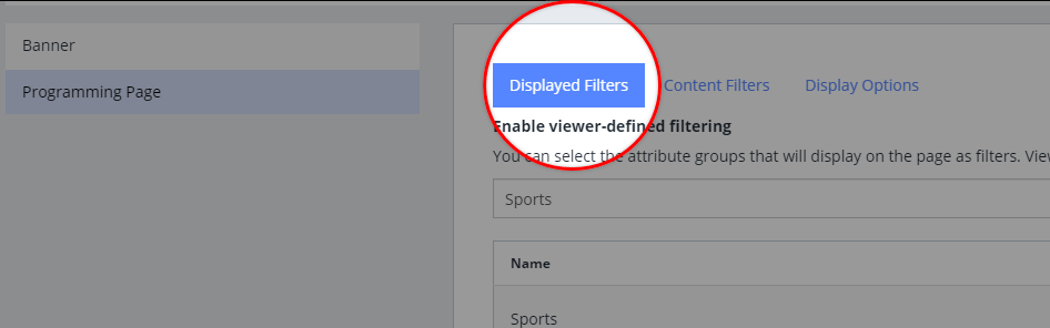
- In the Displayed Filters tab, select an attribute group from the drop-down.
- Click Add.
The attribute group is now added to the list of displayed filters.
Content Filters
In the Content Filters tab, you can filter the video content that will appear on the page based on attribute group and attribute filters. Select the filters that you want and videos that are assigned to those filters will be displayed in on the page.
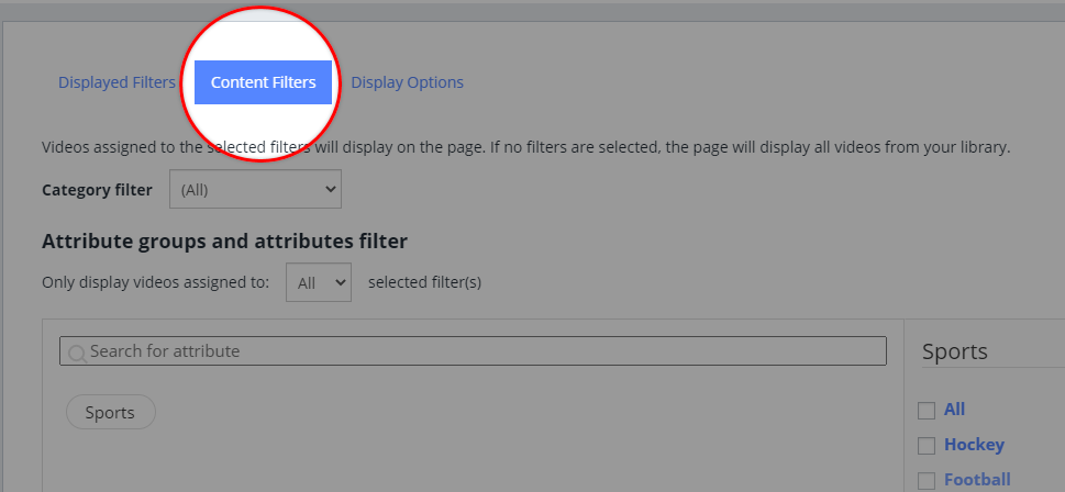
You can use the ' All' or 'Any' filtering option:
- All: A video must be assigned to all of the filters you've selected in order to appear on the page.
- Any: If a video is assigned to any of the filters you've selected, it will appear on the page.
To configure your content filters, follow the steps below.
- Click the Content Filters tab.
- OPTIONAL: By default, 'All' categories are selected. You can select a category from the Category filter drop-down.
- Under Attribute groups and attributes filter, select All or Any from the drop-down.
- Select the attribute group that you want.
- OPTIONAL: After selecting an attribute group, you can also select individual attributes within the group.
- Click Save.
Display Options
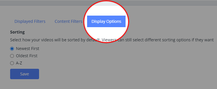
The display options tab provides a few sorting options on how you can display content on the page.
If no option is selected then Newest First will be the page default.
- Choose from one of the following:
- Newest First
- Oldest First
- A-Z
- Click Save.
Customize Theme
See the Site Theme Builder article to learn more about enabling and accessing the theme builder prior to making any changes.
Once the theme builder is active on the back end of your platform you can make changes using the front end shortcut icon on the header menu.
The pen and paper icon for the theme builder will not display on the front end header if it hasn't been enabled first
The following table describes the customizable elements on the theme builder for the Library, Forms & Buttons, and Title sections. You can either add a hex code value into the provided field or use the color palette to choose the desired color for that element.
Learn More about opening, activating and editing the Site Theme Builder.
| Element | Description |
| LIBRARY | Filter Group Background: hex code or use color palette Filter Group Text: hex code or use color palette Font Family: font name Font Style: normal/italic |
| FORMS & BUTTONS | FORM FIELDS Field Text Color: hex code or use color palette Field Background Color: hex code or use color palette Field Border Color: hex code or use color palette PRIMARY BUTTONS Primary Button Color: hex code or use color palette Primary Button Text Color: hex code or use color palette Primary Button Border Color: hex code or use color palette Primary Button Hover Color: hex code or use color palette Primary Button Hover Text Color: hex code or use color palette Primary Button Hover Border Color: hex code or use color palette SECONDARY BUTTONS Secondary Button Color: hex code or use color palette Secondary Button Text Color: hex code or use color palette Secondary Button Border Color: hex code or use color palette Secondary Button Hover Color: hex code or use color palette Secondary Button Text Hover Color: hex code or use color palette Secondary Button Border Hover Color: hex code or use color palette |
| TITLE | Title Color: hex code or use color palette Font Family: font name Font Style: normal/italic Font Weight: light/normal/bold Font Case: none/capitalize/uppercase/lower case |